The outfits met gala this year were… interesting. Some of them were actually pretty nice but with some of these outfits I’m honestly not even sure what went wrong in these designer’s heads.
To start with Emma Chamberlain:
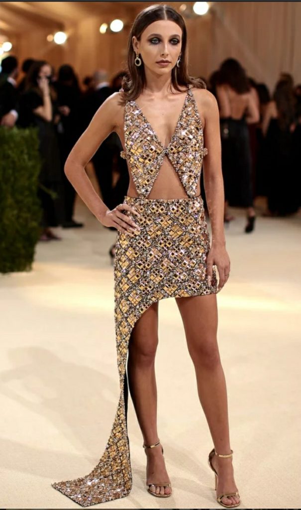
This dress looks likes it was bought off of Shein. The shoes are nice but the dress looks baggy and cheap, like it doesn’t fit. The skirt part is so boxy and it looks like they forgot to trim off the end of the fabric and realized there was excess fabric later and they just went with it. It looks pretty baggy and i don’t really like the mosaic gem pattern (not that bad but it reminds me of snake skin and I personally dont like it all thag much). It looks super uncomfortable. But this is definitely not the worst outfit there.
Kim Kadasian:
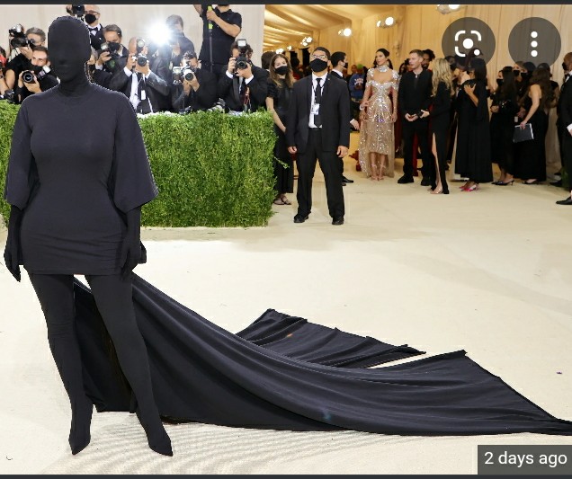
If you’ve seen anything from thos years met you’ve seen this dress. What is that? It looks like stupidity as a visual. Do you have a ninja conference later tonight? Why does the designer think this is okay? No one thinks this looks good at all.
I honestly dont know a lot of celebrates names so his name his Cereal Man:
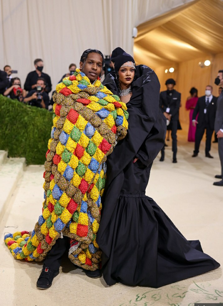
Okay dude, you like cereal, do you really need an outfit to show that. You couldn’t just say that? Or maybe this was his rug and he realized he was out of clothes, pulled on his rug and got in the car. The material looks like a blanket.
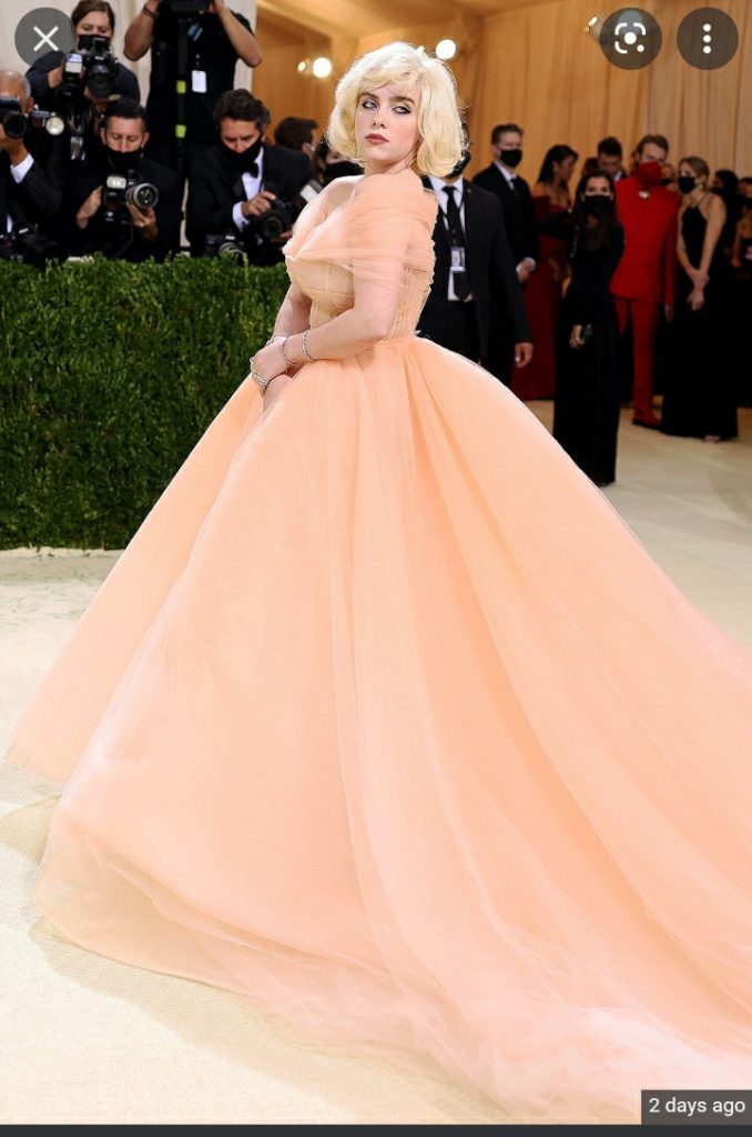
There were some good dressesthough, Billie Ellishfor example:
This is considered the best dressed for the Met (that I know of):
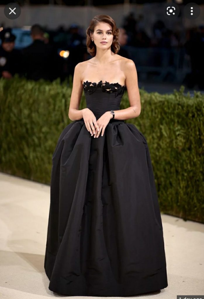
Ok, I’ve seen her before but I can’t remember her name, I’m sorry.
However, I can see a light pink dress going really well with this over it. The way it flows is super elegant. I love the pattern and the jewels. I live the necklace. Her hair and her make up looks great. The style is great. I think it would be a dress you could see at a fancy dress store if it had some maybe silk or velvet or taferta light pink cloth under it.
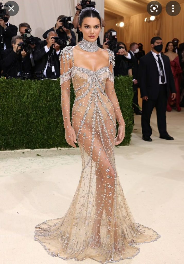
It’s not the worst here. It’s just unpractical. I understand they want to be unique and shocking so I guess it does full fill that purpose.
Here’s the last one for now:
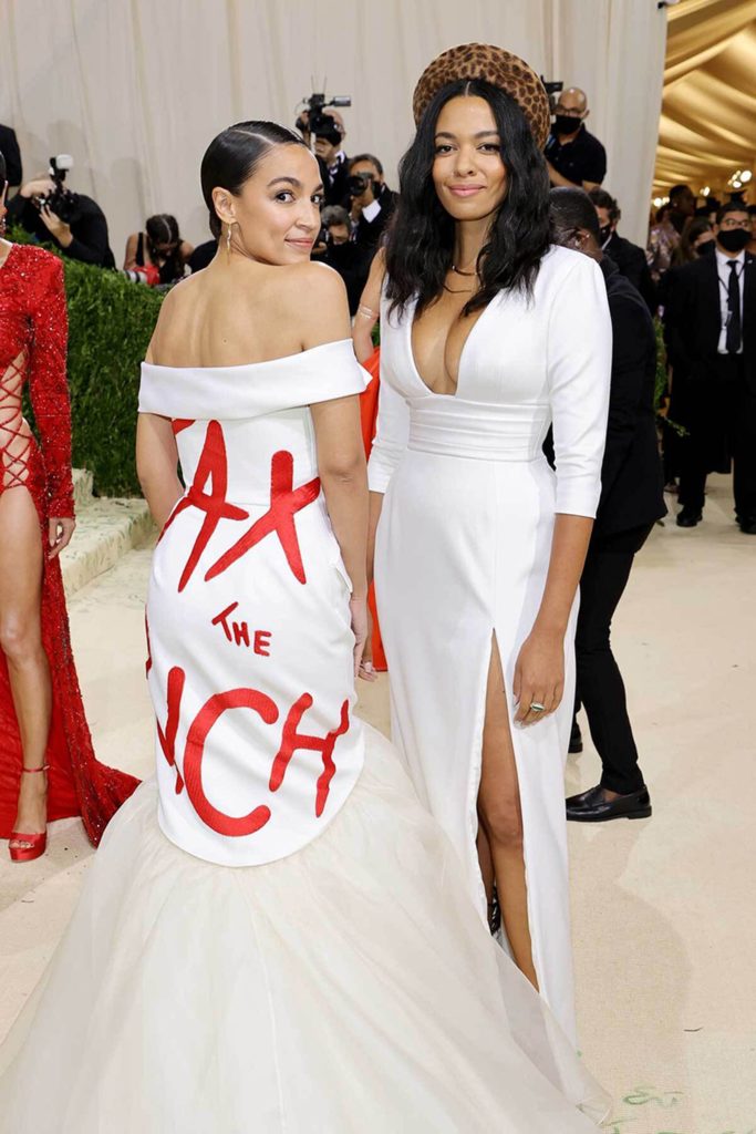
The dress would be pretty, a bit uncreative in form and style but still nice if it didn’t have the writing. The red and white and in thag font makes me think of Chick-fil-A (the absolute most delicious of all restaurants, don’t care about the politics around it, just as a general statement we can all agree Chick-fil-A is perfection). I like the fabric at the top, looks super comfy and I’m also a fan of the arm instead of shoulder strap, a bit simple but the style isn’t too bad actually. She also got a free $300,000 ticket to go to the Met and then wore that dress, come on, tell me you’re privlages without telling me your privileged. Is she the only one who can’t see the irony in receiving a $300,000 ticket to the Met where she wore a dress that said “tax the rich.”
The lady next to her looks really good, her dress is fancy and simple, nice color, nice cloth, looks good on her. I think if you cut the bottom and made it knee length it would be an improvement.
Bith dresses are fancy, seems like something you’d wear to a cocktail party. The look nice (besides the writing) but maybe not for the met gala. It’s a bit too simple, not unique or original enough for the Meta gala.
Some of these dresses were nice but a few of these were extremely stupid and hideous. Some of them are graceful, elegant, draw attention, and/or jaw dropping while others are a complete fail. Some of them are ridiculous, to simple, childish, and trashy.